Appearance
7.6 — The Bell Curve and the Central Limit Theorem
Drop a ball into a board studded with pegs. At each peg it bounces left or right at random. After twenty rows it lands in one of twenty-one slots at the bottom.
Drop a thousand balls and the pile that accumulates is not flat and not random-looking. It is a smooth, symmetric mound: tall in the middle, tailing off on both sides. Every time.

That shape is the normal distribution, also called the Gaussian. It is the most important distribution in statistics, and this chapter is about why it turns up everywhere.
1. The formula, read piece by piece
f(x) = \frac{1}{\sigma\sqrt{2\pi}}\;e^{-\frac{(x-\mu)^2}{2\sigma^2}}
It looks forbidding and every part has a job.
(x-\mu)^2 — the squared distance from the mean. Symmetric, so values equally far above and below are equally likely.
The minus sign in the exponent — probability falls as you move away from the centre.
e^{-\text{something}^2} — the fall is extremely fast, faster than exponential. This is what gives the normal distribution its famously thin tails.
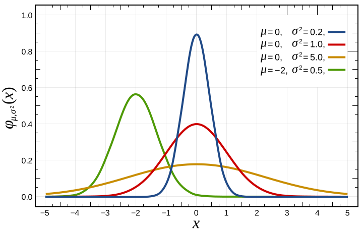
2\sigma^2 in the denominator — sets the width. A large \sigma makes the exponent small, so the curve falls slowly and is wide.
\frac{1}{\sigma\sqrt{2\pi}} — a scaling constant that makes the total area exactly 1, as every density must. The \sqrt{2\pi} is where Chapter 5.7's polar-coordinate trick shows up: it is there because \int e^{-x^2}dx = \sqrt\pi, which was computed by squaring the integral and switching to polar coordinates. The \pi in this formula genuinely comes from circles.
Two parameters — \mu the mean and \sigma the standard deviation — determine everything. The normal distribution is the only common distribution completely pinned down by its mean and spread, which is part of why it is so convenient.
2. The 68-95-99.7 rule
P(\mu-\sigma \lt X \lt \mu+\sigma) \approx 68\%
P(\mu-2\sigma \lt X \lt \mu+2\sigma) \approx 95\%
P(\mu-3\sigma \lt X \lt \mu+3\sigma) \approx 99.7\%
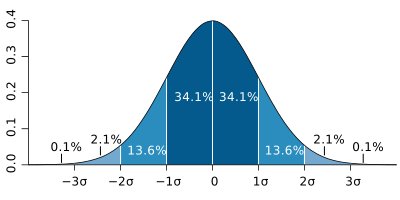
Worked example. Adult male height in India averages about 165 cm with a standard deviation of about 7 cm. So roughly 68% of men are between 158 and 172 cm, 95% between 151 and 179, and 99.7% between 144 and 186. Someone at 193 cm is four standard deviations out, which happens to about 1 person in 16,000.
The z-score converts any normal variable to a standard scale:
z = \frac{x-\mu}{\sigma}
"How many standard deviations from the mean." A z-score of 2 always means the same thing — top 2.3% — whatever the original units. This is why one table of normal probabilities serves every normal distribution, and it is the standard preprocessing step before feeding data to a machine learning model.
And it is what "six sigma" means. A process whose specification limits are six standard deviations from the mean produces about 3.4 defects per million (allowing for the 1.5-sigma drift the methodology assumes). The name is a statement about z-scores.
Before the theorem, it is worth having the curve itself under your hands, since its two parameters do quite different jobs.
Hover one standard deviation above the mean and read the green curve: about 0.84. Subtract the 0.16 below the other side and you have the 68% of the rule above, obtained by reading rather than remembering.
3. The Central Limit Theorem
Here is the result, and it is genuinely remarkable.
Take any distribution with a finite mean and variance. Draw n independent samples and average them. As n grows, the distribution of that average approaches a normal distribution — regardless of what the original distribution looked like.
\bar{X} \;\longrightarrow\; \text{Normal}\!\left(\mu,\;\frac{\sigma^2}{n}\right)
The original can be uniform, skewed, bimodal, discrete, or shaped like a saw. The averages come out normal anyway.

Why it is true, informally. Averaging cancels out the peculiarities of the source. Extreme values in one direction are offset by extremes in the other, and what survives is the accumulation of many small independent contributions. That accumulation has only one possible limiting shape.
Why it matters so much: it explains the ubiquity of the bell curve. Any quantity that is the sum of many small independent influences will be approximately normal, and a great many real quantities are exactly that.
- Height is the sum of hundreds of genetic effects plus nutrition and environment.
- Measurement error is the sum of many small independent errors.
- Exam scores aggregate many small factors.
- Blood pressure, IQ scores, manufacturing dimensions — all the same.
Note the variance in the theorem: \frac{\sigma^2}{n}. So the standard deviation of the average is \frac{\sigma}{\sqrt n}, which is Chapter 7.4's square-root law appearing again as the standard error. This one quantity is the foundation of all of statistical inference, and Chapter 7.7 builds on it.
How large must n be? The usual rule of thumb is 30, but it depends on the source. A source that is already symmetric converges after about 5; a heavily skewed one may need hundreds. A power-law source with infinite variance never converges at all, because the theorem's condition fails — and that is exactly why financial risk models built on normal assumptions fail during crises.
4. Why the bell curve is not always right
The normal distribution is over-applied, and knowing when to distrust it is as valuable as knowing when to use it.
Its tails are extremely thin. A 5-sigma event has probability about 1 in 3.5 million; a 10-sigma event is about 1 in 10^{23}. Financial markets produce moves that would be 20-sigma or worse under a normal model, and they produce them every few years. Under a normal model that is impossible; under a fat-tailed model it is expected.
In August 2007 a Goldman Sachs executive said their funds were seeing "25-standard-deviation moves, several days in a row". Under a normal distribution, one such day should not occur in the lifetime of the universe. The correct conclusion was that the distribution was not normal, not that something astronomically unlikely had happened.
Nothing physical is truly normal. The normal distribution assigns nonzero probability to every real number, including negative heights and negative times. It is always an approximation over a limited range.
Skewed data is not normal. Income, house prices and waiting times are bounded below by zero and have a long right tail. Taking logarithms often makes them approximately normal — the log-normal distribution, which arises when effects multiply rather than add, since the logarithm turns multiplication into addition (Chapter 1.4) and the central limit theorem then applies to the sum.
5. Galton, regression, and a caution about eugenics
Francis Galton studied heights of parents and children in the 1880s and found something he called regression to the mean: tall parents have tall children, but on average less tall than themselves. Short parents' children are short, but less so.
This is not a biological force pulling towards average. It is a statistical necessity whenever the correlation between two measurements is less than perfect. Any extreme measurement is partly signal and partly chance; the chance part does not repeat, so the second measurement is closer to the middle.
Where this catches people out constantly:
- A student who does exceptionally well on one test usually does less well on the next. Not because success breeds complacency — because part of the first score was luck.
- The "Sports Illustrated cover jinx" — athletes featured after an exceptional run tend to do worse afterwards. They were at a peak partly by chance, and the chance did not persist.
- Praising a good performance seems to make it worse and criticising a bad one seems to help. Daniel Kahneman describes flight instructors concluding from exactly this that criticism works better than praise. Both effects are regression to the mean, and drawing a causal lesson from them is a mistake with real consequences.
- Any medical treatment given when symptoms are at their worst will appear to work, because symptoms fluctuate and were going to improve anyway. This is precisely why control groups exist.
The word "regression" in linear regression (Chapter 7.8) comes from Galton's phrase, which is why a technique about fitting lines carries a name about heights returning to average.
Galton also founded eugenics, coined the word, and used exactly this statistical machinery to argue for it. The mathematics he developed — correlation, regression, the use of the normal distribution in human measurement — is sound and is used daily. The social programme built on it was a catastrophe that led directly to forced sterilisation laws in several countries and provided intellectual cover for far worse. The tools are neutral and the conclusions drawn from them were not, and it is worth knowing that a founding figure of modern statistics is also a cautionary example of what happens when a scientist mistakes a correlation for a mandate.
6. Where this shows up in your life
Every quality control chart. Control limits are drawn at three sigma.
Every poll's margin of error. The \frac{\sigma}{\sqrt n} standard error, converted to a 95% interval.
Every standardised test score. IQ is defined to have mean 100 and standard deviation 15 — the scale is a z-score in disguise.
Every measurement uncertainty in science. Reported as \pm one standard deviation, and "5 sigma" is the threshold particle physics uses to declare a discovery.
Every machine learning preprocessing step. Standardising features to zero mean and unit variance is computing z-scores.
Every risk model — and every failure of one, when the tails turned out to be fatter than assumed.
We have distributions. What we do not have is a way to go backwards: from data in hand to a statement about the world that generated it. That is statistics, and it is where mathematics meets judgement.